
How To Use Blinkfire Dashboards To Power Social Media Content & Insights
Just like creating unique dashboards for social media and website reporting on platforms like Google Analytics, Hubspot, and Sprout Social, you can do the same in Blinkfire with Blinkfire Dashboards.
With Blinkfire Dashboards create customizable, interactive dashboards that shows real-time social media insights. Dashboards are helpful when comparing data and looking for trends. Teams, leagues, media companies, brands, and agencies use our dashboards to help with overall marketing strategies, content valuations, and social media tracking.
The 411 on Blinkfire Dashboards
Everyone values and tracks metrics differently, so Blinkfire empowers users with customizable dashboards. Reporting widgets include four categories: KPI trends, top posts, lists (Global Ranking, Blinkfire Index), and playlists. Once set up, a Blinkfire dashboard is shareable — with team members or partners.
Dashboards are a Blinkfire customer favorite because the possibilities are endless on the types of dashboards you can create. We like to bundle dashboards into five categories: social media, sponsorship, content, benchmarking, and events. In this blog, we’re walking through what each dashboard does and the benefits plus examples.
Social Media Dashboards
Build dashboards to track social media channels (your own or others) based on a seven, 14, or 30-day window. Social media dashboards are created depending on what works best for you and your team. For example: you can create a dashboard for Asian social networks or track TikTok KPIs for followers, engagements, impressions, post count, and top posts. Here’s a simple breakdown of the pieces that make up a social media dashboard.
- Followers: Follower growth based on the number of followers and percent increase
- Engagements: Total number of engagements earned
- Impressions: Total number of impressions
- Post Count: Total number of posts
Use Case: Track engagements per platform for the past 14 days. This NBA dashboard tracks the league’s TikTok, Facebook, Twitter, Instagram, Sina Weibo, YouTube, and VK channels.

Sponsorship Dashboards
Create dashboards to track KPIs for your team’s official sponsors. Select a specific brand then choose which KPI: engagement, valuation, impressions, and post count.
Some sponsorship dashboards are built based on one specific brand. Other dashboards could use a team’s top five sponsors.
Use Case: If you’re an NBA team, patch sponsorship exposure on social media is an important data point to monitor. This LA Lakers dashboard tracks patch partner Bibigo based on overall engagement, valuation, impressions, and posts over the last 14 days.

Content Dashboards
Create dashboards that track content based on playlists (a compilation of curated posts) or top posts.
Playlists
One of Blinkfire’s most used features is Playlists. Use playlists for a variety of reasons: game day post collections, sponsor highlights, campaigns, and content series like birthday, score, or game preview graphics.
Use Case: The NBA posts numerous pieces of content throughout the season. 1) Score graphic carousels on Instagram of winning teams after a night of games. These score graphics earn high engagement and valuable exposure. 2) One of the NBA’s partners is Kia. At the beginning of the 2022/23 season, the NBA has used #KiaTipOff22 on posts across social media. This dashboard tracks the top 5 posts from two playlists: “NBA Swipe – Instagram” and “NBA KiaTipOff22”. Posts are filtered based on engagement and valuation.

Top Posts
If you want a snapshot of the top posts your social media team is publishing, look no further than Top Posts Dashboards. These dashboards give users a quick view of their top-performing content to gather insights and trends.
Use Case: Some content may perform better on Instagram than on Twitter. To have data to back that up, create a dashboard of top posts from your social media accounts. This NBA dashboard shows the top five posts from TikTok, Facebook, Twitter, Instagram, Facebook, YouTube, and VK from the past 14 days.

Benchmarking Dashboards
Here is where dashboard magic is made. Benchmarking is one of the best ways to use Blinkfire Dashboards. Create a dashboard based on pretty much any comparison you’d like. Here are some ideas:
- NBA Teams x Jersey Patch Partner
- Chicago Sports Teams x TikTok Followers, Engagement, and Top Posts
- Aspirational Sports Teams on Social Media: What teams do social “right” that you want to learn from. There’s a dashboard for that.
Use Case: As an NBA team, don’t just track your team’s jersey patch partner but also look at how other teams in the NBA give exposure to their patch sponsors. This dashboard shows NBA teams and patch partner engagement over the past 30 days.

Event-Based Dashboards
Because dashboards are a snapshot over a seven, 14, or 30-day window, they are perfect for events, playoffs, or tournaments. You can track KPIs during the two weeks of a tennis grand slam, or the four days of a golf tournament. Another thought: as a team in the playoffs — track how your team and opponent do on social media during a series.
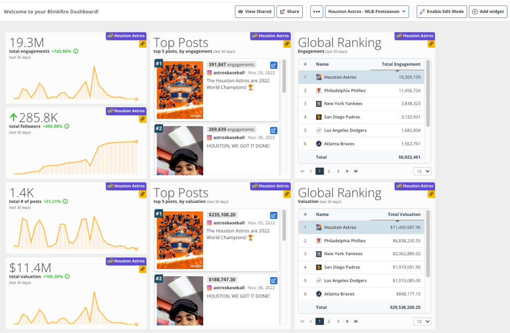
Use Case: Create a dashboard to track MLB postseason play. This Houston Astros dashboard shows the team’s 30-day social media performance plus Global Ranking widgets on engagement valuation. It is a perfect way for the Astros’ social media team to keep tabs on insights.
Have an insight or KPI you want to track? There is probably a Blinkfire Dashboard you can create. Sharing information in real-time is valuable, and Blinkfire customers benefit by turning data into insights.
Interested in learning how Blinkfire Analytics can track your social media, sponsorships, and more? Get in touch today!


No Comment